Skip to content
TPD Design House
Menu
+
Studio
Projects
Services
Press
Contact
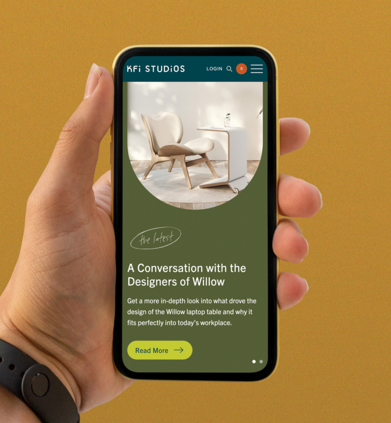
Branding & Interactive
View
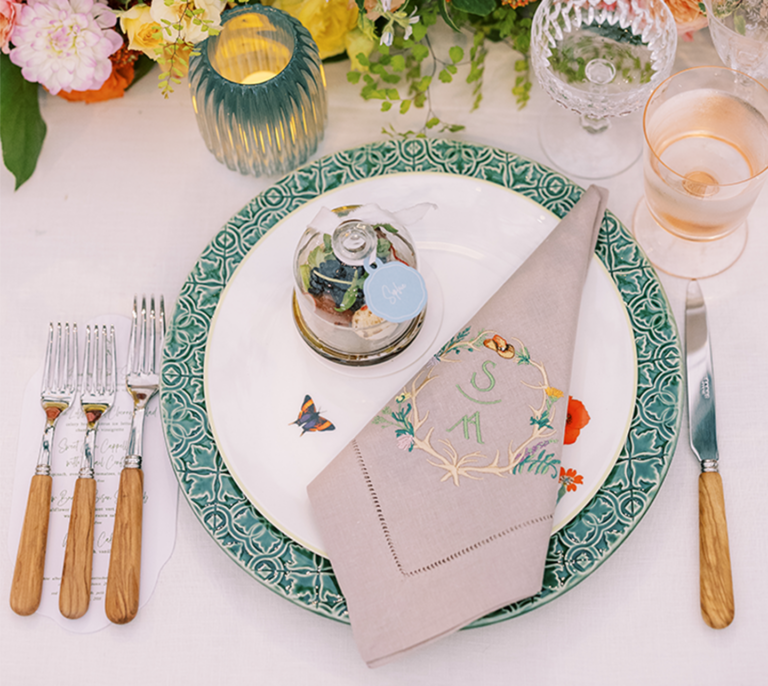
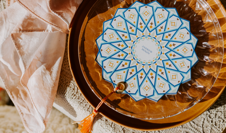
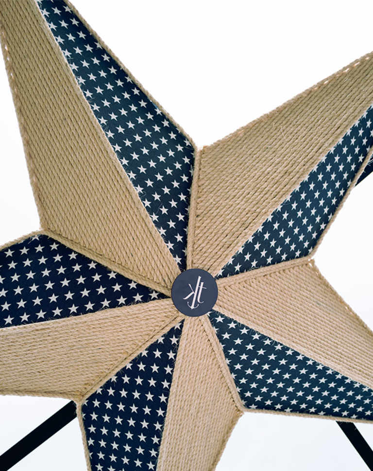
Weddings & Celebrations
View